top of page

COMPOSITION:
PRINCIPLES
AND ELEMENTS OF DESIGN
In the same way that a chef must follow a recipe to create exciting and interesting creations in the kitchen, a photographer must use a recipe to help guide him or her toward success. The tools that help guide good creative choices are called the principles and elements of design.
KEY
TAKE-AWAYS
The principles of design
The elements of design
Six
PRINCIPLES
of Design
Repetition
Contrast
Unity
Balance
Emphasis
Depth
Google will turn up a number of variations of the Principles of Design. Some lists will contain more, some with different names. For our purposes, these are the six we will consider. Regardless of how many you find, or what they are named, these principles are used to bring order to your image, create a hierarchy of objects and subjects, and focus your viewers' attention. You will find different images make use of more or less of these principles in varying degrees, used in changing combinations.
The Principles of Design are another set of tools in your toolbox. How you use the tools depends on your circumstances. High contrast may work in one image, but another might call for low contrast. There's no right or wrong, good or bad. There are appropriate applications of each, and the only way to learn is to try it.
READINGS
The following readings explains the principles and how to use them.

1a_repetition_1

1b_repetition_2
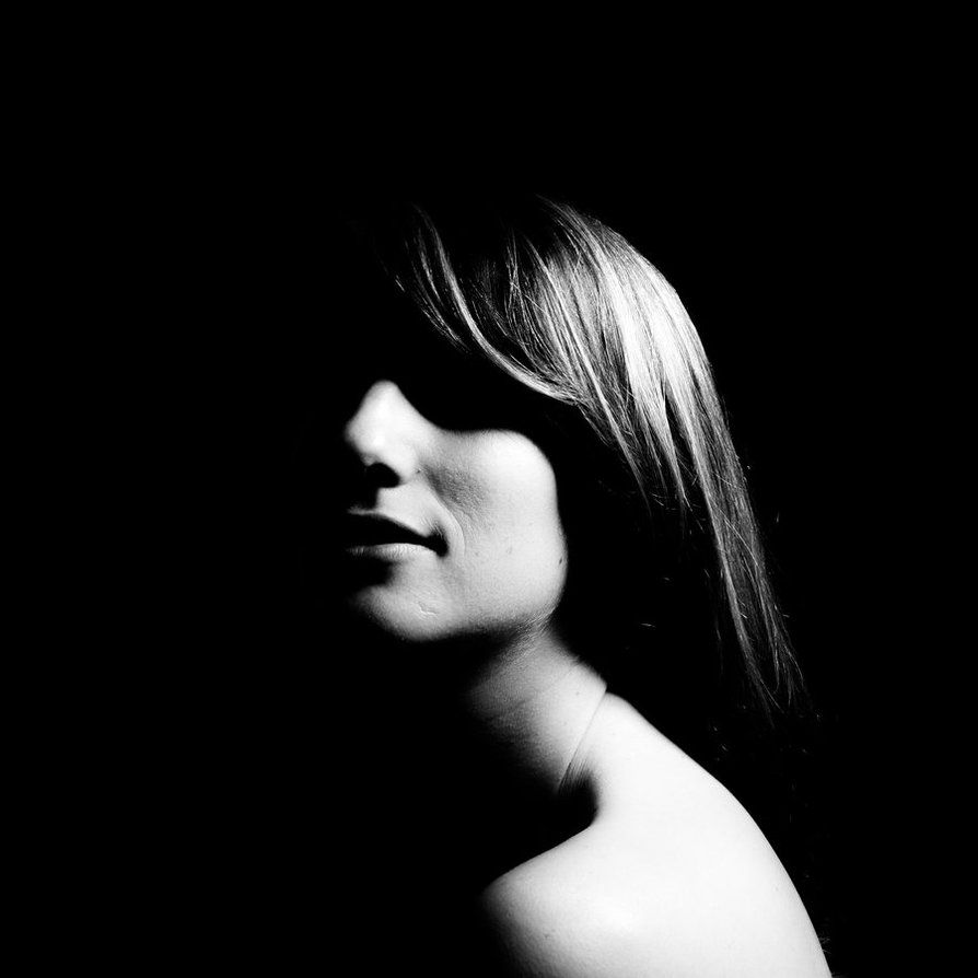
2a_high_contrast_bw
Repetition
Repetition can be used as a tool to guide the viewer's eye through an image. The repeated element might be the main subject or alternatively, repeated elements can be used to force the viewer to notice a break in the formation. This is a way of creating emphasis by juxtaposing an object against a pattern.
Contrast
Although in theory the concept of contrast could apply conceptually to the subject (rich/poor or new/old etc) for our purposes we are talking about visual contrast differences. This is most clearly defined by the difference between light and darks. The fewer grey or midtones the more contrast. This doesn't necessarily apply only to black and white images. Contrast can also be achieved between colours.
Unity
This is the most difficult principle to define clearly. Unity is the way the elements fit together to make the whole. Unity comes from well balanced and cohesive use of the principles and elements of design to create a pleasing image. It might be helpful to understand the concept by looking at an image that does not have good unity. The organic shapes clash with the precise vertical lines to create an uneasy, jarring result.
Balance
This refers to how the elements of your photo are disributed in the frame. You aren't necessarily aiming to create balance. You should simply be aware of how balance changes your image. If you weight one side of the image more heavily, how does that affect the viewer's focus? Understanding the implications of balance allow you to better convey your message. There are multiple ways to balance an image.
Emphasis
What's important? Where do you want your viewer's eye to rest? Maybe you want the viewer to keep scanning the image. We use a variety of compositional tools to create emphasis. These tools can include any number or combination of size, contrast, line and other design elements.
Depth
This refers to the distance between the closest and farthest subject in your frame. It can also take into account the distance of the camera/viewer from the subject. This tool can be used to create a sense of being immersed in the image or viewing a scene from afar. Keeping depth in mind when setting up an image helps avoid flat, boring compositions.
HW
Take one photo for each of the Principles of Design (6 in total).
-
Upload to an album in Flickr
-
Name each photo according to the principle it demonstrates
-
These photos will be used in the assignment for this unit
IN-CLASS ACTIVITY
Six
ELEMENTS
of Design
Line
Shape
Texture
Form
Colour
Pattern
Similarly, the Elements of Design are also used by photographers to build drama and emphasis in their photos. Returning to the initial metaphor of a cook following a recipe to create exciting meals, if the Principles of Design are the tools, then the elements are the ingredients. Without the elements of design, we have no image.
READINGS
The following readings explains the principles and how to use them.

Line
Elements of design: Line, image credit Martine Magnone

Shape
Elements of design: Line, image credit Grant Flavelle | 2014

Texture
Elements of design: Line, image credit Ruochen Zhoa | 2014
Line
A useful tool in the photographer's arsenal is line. Whether being used to draw the viewer's attention to a specific subject or part of the photo or to create a sense of either balance or imbalance, lines, whether horizontal or vertical, diagonal or converging can be used to great effect in photography. The profile and strength, directionality and stability of lines can be used to make a photo feel strong, stable, balanced, dynamic and more.
Shape
Shape is the typical outline we associate with something. A good example is a silhouette of something recognizable, like a person or a car. Shapes can also be implied. By positioning subjects appropriately, the photographer can create geometric shapes to imply stability or order. The opposite, a lack of shape, can be used to create chaos, disarray or randomness.
Texture
Texture adds to how tactile an image is. The rough, curled edges of peeling paint. The bristly whiskers of a greying beard. Texture is created by sharp differences in value (lightness and darkness) often amplified by side lighting, and thus the creation of shadows.
Form
Related to shape, form is the way colour, light and shadow interact allowing the viewer to make sense of what they are viewing. The shape of a hand is 5 fingers, open-palmed. A fist is still a hand, though it's not immediately recognizable in silhouette. Adding lights and darks helps the viewer determine the form of what they are viewing: a fist.
Colour
Colour affects multiple elements of an image. Brights, vibrant colours can be used to add vitality to an image. De-saturated colours can be used to change the mood of a photo. There is a family of colours that are associated with warmth (reds, yellows and oranges) and a further set that are considered cool (blues, violets and greens). Being familiar with the colour wheel, complementary colours, and how colour can be used to imply a mood will make your images stronger.
Pattern
Patterns exist everywhere. Seeing them and using them in your photography can help you draw attention to a subject or reduce the importance or focus on a subject. Typically, in photography, patterns are emphasized or alternatively, they are broken.
IN-CLASS ACTIVITY
Take one photo for each of the elements of design (6 in total).
-
Upload to an album in Flickr
-
Name each photo according to the principle it demonstrates
-
These photos will be used in the assignment for this unit
HW
bottom of page